BioIQ
Evolving an identity for a health testing company.
Services
Brand IdentityCMSContent ArchitectureContent StrategyPrint DesignResponsive DesignSupport & MaintenanceUX-UI DesignVideoWeb Development
Client
BioIQ Inc.
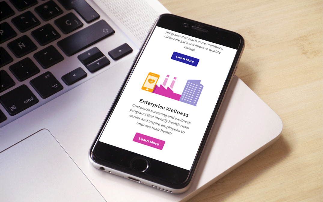
BioIQ provides tools that simplify worksite and at-home health testing programs, help organizations understand population health risks, and motivate participants to take action to prevent and manage chronic conditions.


We worked closely with the team at BioIQ to help improve user experience by redefining their design standards. BioIQ briefed us to strategically evaluate & unify the brand’s user interface across its products and marketing materials.


With a clear direction and a consistent digital brand guide that would steer all future UI design for BioIQ was designed, across multiple touch-points.
Every brand needs to carry an identity across its products. Maintaining a common visual language which binds the products together and separates them from competitors is vital. A new set of icons was designed for the B2B website and marketing materials.


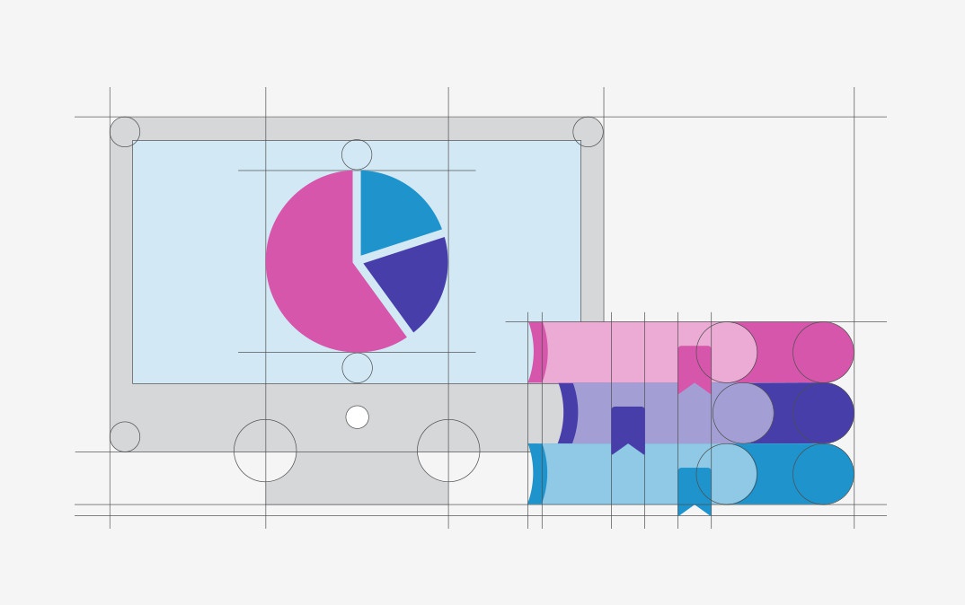
Consistent branding provides a foundation for development. We refreshed the logo, color palettes, icons and corporate fonts. We also designed a brand pattern with a unique look and feel. A new web site was designed and developed using this new visual language.


Thanks to the new visual identity, BioIQ now has a unique look and feel that helps them stand out on the market and enables them continue releasing new innovative health testing solutions that are visually consistent with the whole brand.
